Your cart
Product Title
$0
$0
-
+
Thank you! Your submission has been received!
Oops! Something went wrong while submitting the form.
Coupon1
Coupon2
Cart note
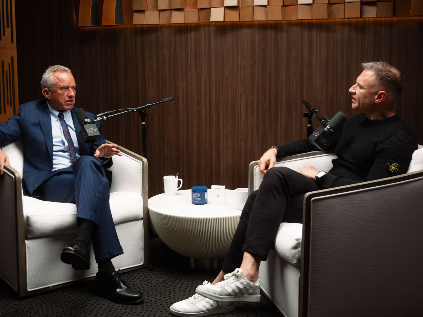
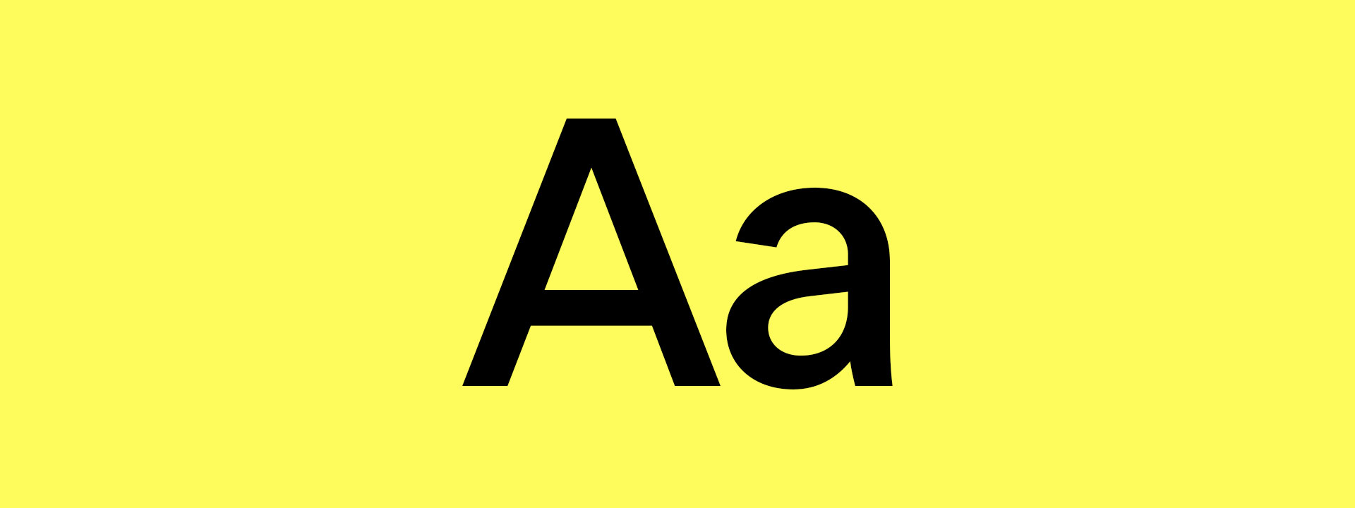
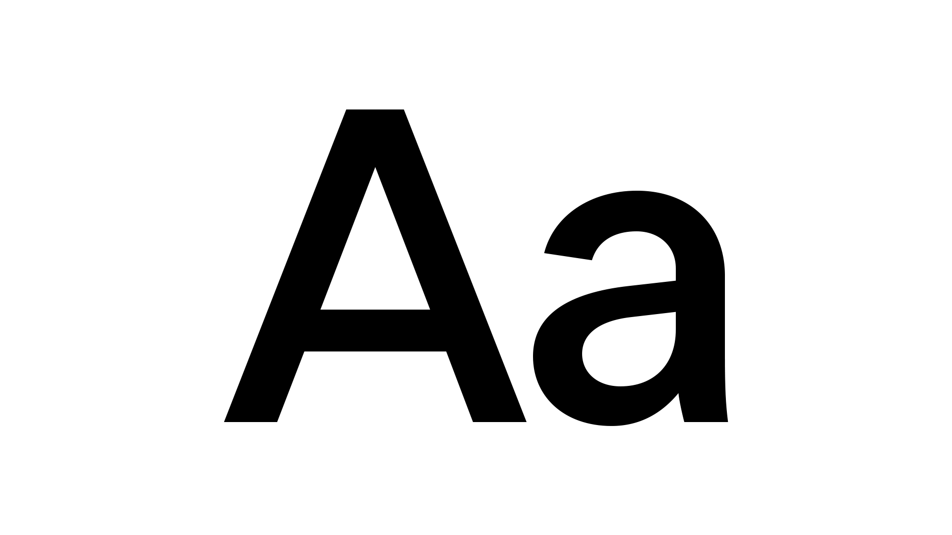
Typography plays a vital role in how we express clarity, intelligence, and performance across all brand communications. Our type system is designed to simplify complex information, guide attention, and maintain consistency across every medium. These typefaces reflect our brand philosophy: precision without pretension, modern structure with a human feel. Every font choice reinforces our mission to make science more accessible and actionable.
Our core brand typeface, LT Superior, is a modern geometric sans-serif with clean structure and strong visual rhythm. It delivers confidence and clarity across headlines, navigation, and packaging.
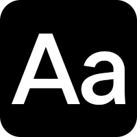
For digital use cases that require a technical or data-driven aesthetic, we use LT Superior Mono. This monospaced variant adds a functional, lab-like precision to callouts, ingredient labels, diagnostics, and numbers. It reinforces our science-forward identity while keeping the system cohesive.
Our typography is more than design, it’s a communication tool. Whether we’re breaking down a scientific concept or introducing a new product, we apply type with clarity, purpose, and consistency. By assigning clear roles to each font weight and style, we ensure every message – across digital, packaging, and education – feels unmistakably Ultimate Human.