Your cart
Product Title
$0
$0
-
+
Thank you! Your submission has been received!
Oops! Something went wrong while submitting the form.
Coupon1
Coupon2
Cart note
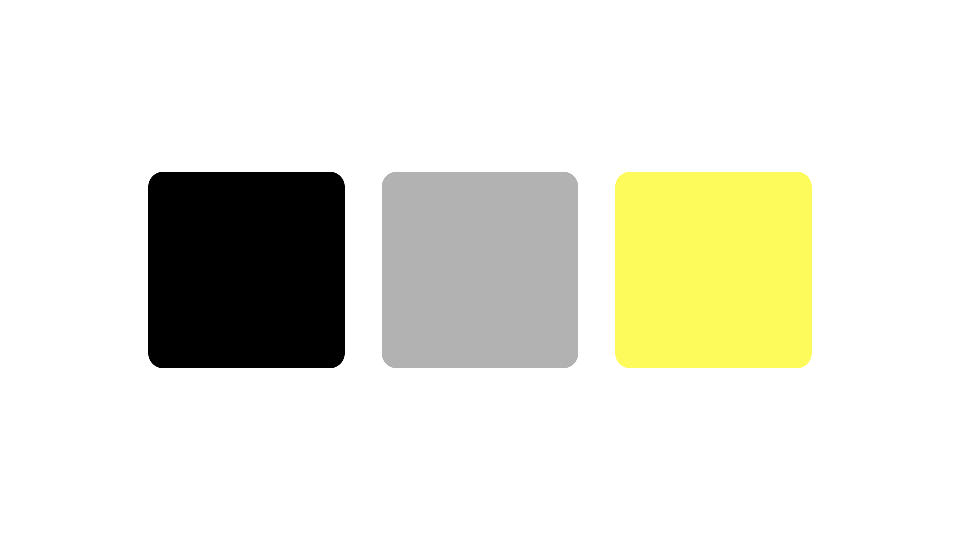
تلعب الطباعة دورًا حيويًا في كيفية التعبير عن الوضوح والذكاء والأداء عبر جميع اتصالات العلامة التجارية. تم تصميم نظام الكتابة الخاص بنا لتبسيط المعلومات المعقدة وتوجيه الانتباه والحفاظ على الاتساق عبر كل وسيط. تعكس هذه الخطوط فلسفة علامتنا التجارية: الدقة دون ادعاء، والبنية الحديثة ذات الطابع الإنساني. كل اختيار للخط يعزز مهمتنا لجعل العلوم أكثر سهولة وقابلية للتنفيذ.
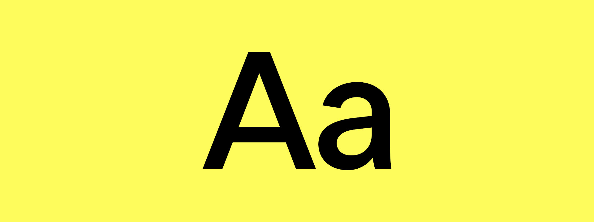
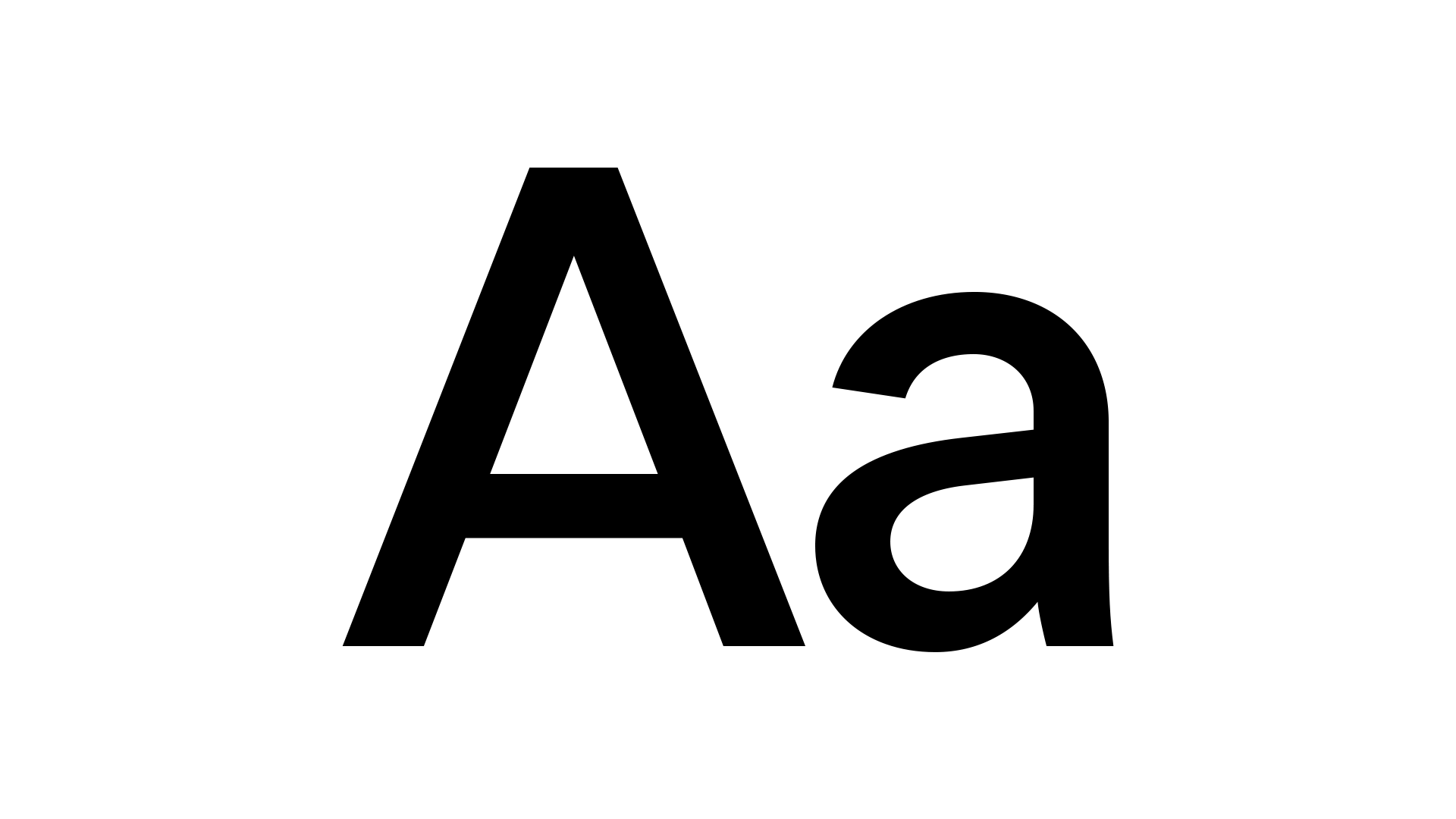
محرف علامتنا التجارية الأساسية، LT Superior، هو أسلوب هندسي حديث بدون سيريف بهيكل نظيف وإيقاع بصري قوي. فهي توفر الثقة والوضوح عبر العناوين الرئيسية والتنقل والتعبئة.
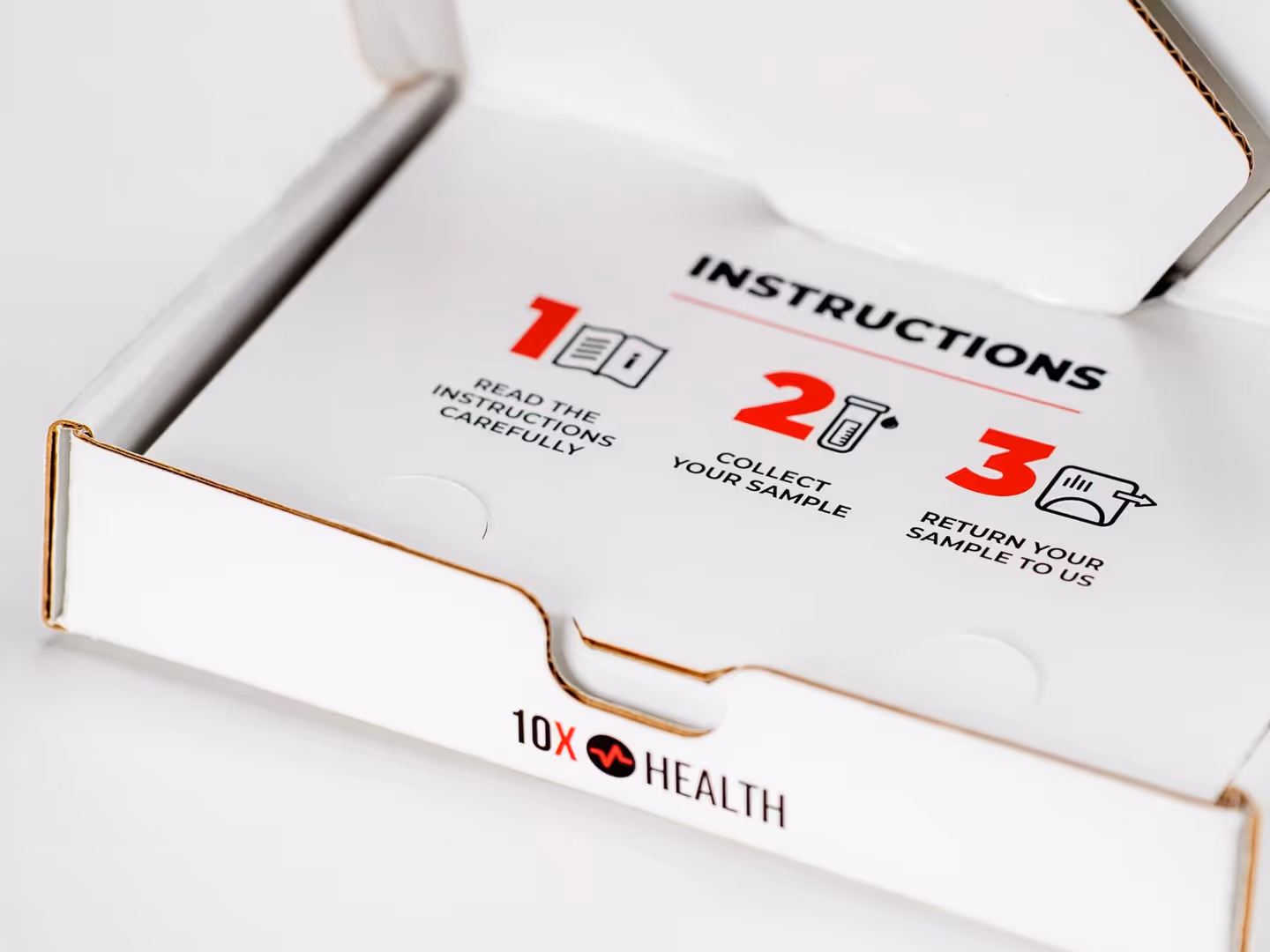
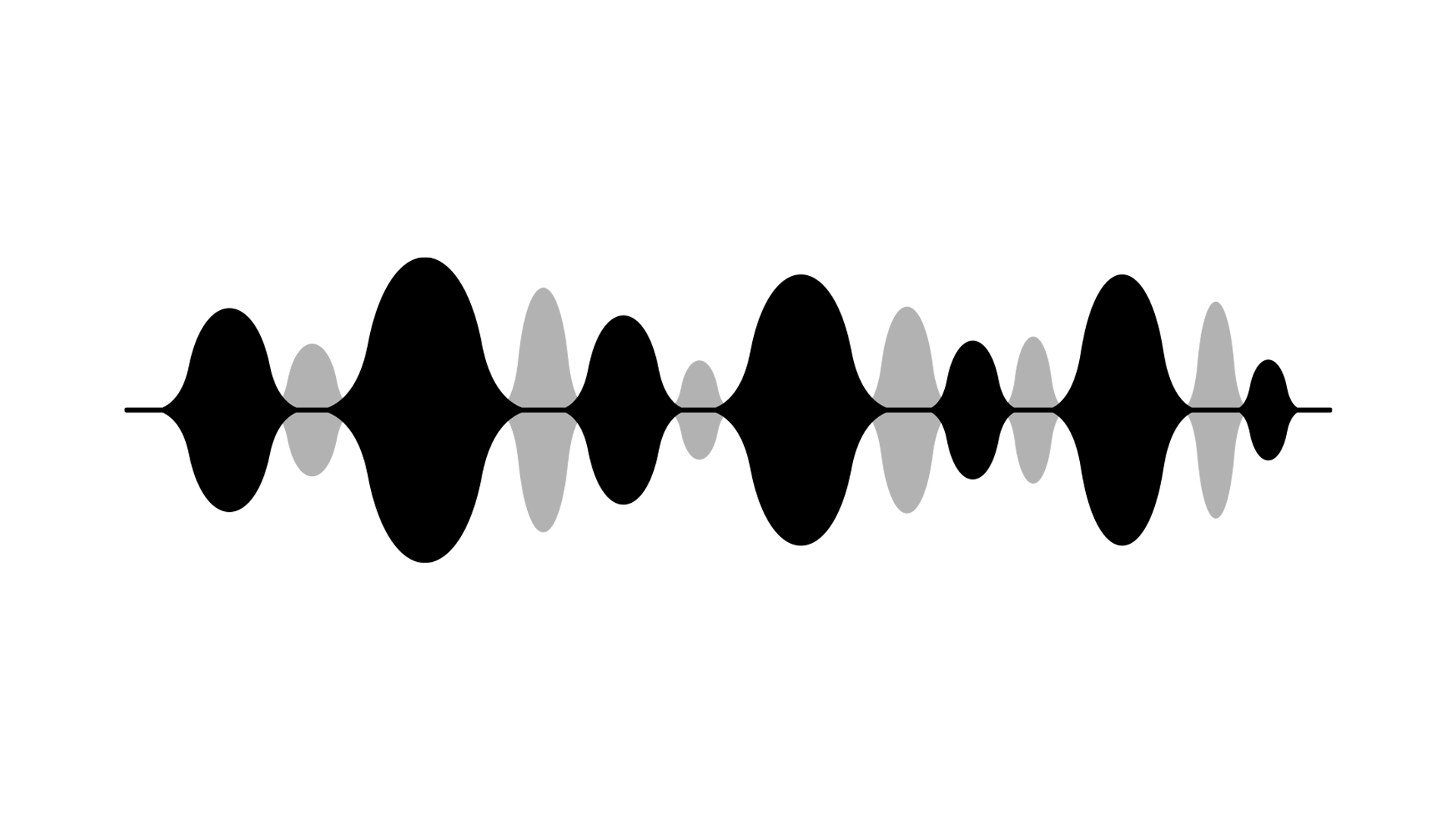
بالنسبة لحالات الاستخدام الرقمي التي تتطلب جمالية تقنية أو تعتمد على البيانات، نستخدم LT Superior Mono. يضيف هذا البديل أحادي المسافة دقة وظيفية تشبه المختبر إلى وسائل الشرح وملصقات المكونات والتشخيصات والأرقام. إنه يعزز هويتنا العلمية المتقدمة مع الحفاظ على تماسك النظام.
الطباعة لدينا هي أكثر من مجرد تصميم، إنها أداة اتصال. سواء كنا نحلل مفهومًا علميًا أو نقدم منتجًا جديدًا، فإننا نطبق النوع بوضوح وهدف واتساق. من خلال تخصيص أدوار واضحة لكل وزن ونمط خط، نضمن أن كل رسالة - عبر الرقمية والتعبئة والتعليم - تبدو بلا شك في Ultimate Human.